

complaint
Firefox4 has a HORRIBLE INTERFACE! Where can I post feedback about the RC4 client? on this site: http://blog.mozilla.com/blog/2010/07/06/firefox-4-beta-1-tell-us-what-you-think/ there is a link to provide feedback - and the link does not work...
All Replies (17)
If you prefer a menu bar instead of the Firefox button, you can right-click on the FIrefox button and choose the "Menu bar" option to re-enable it. Most parts of the Firefox interface can be customized in many ways, and you can even restore them to the way they looked in Firefox 3.6 if that is what you like best.
Thanks MBrubeck -but that answer is not good enough as I'm not only talking about the menu bar - but the ENTIRE INTERFACE - the positioning of ALL the things have changed and I hate it. I did not see any such customizing ability - and more importantly why force a change on people when the old system worked so perfectly well? Why not have the default interface REMAIN the same as it has since its creation; and let those who want something else figure out how to customize it... Or in the least upon first boot it should take you to an interface tutorial and walk you through setting up the interface - introduction to addons - intro to personas - intro to every other feature that most simple users will never know exist...
The following image shows what I want...
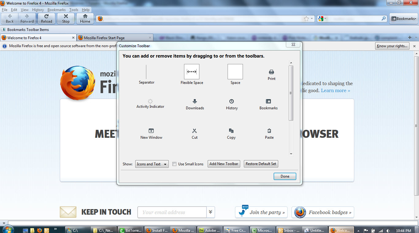
Many options are availible if you access the customize dialog. You can move around and add many buttons. Right click anywhere on the toolbar, select Customize...
The worst thing that happened to me today was my FireFox automatically updated to 4th version. Spend an hour to find/download and install back FF 3.5.2 version and made sure I disable auto updates in future. Main problem was status bar. Found a fix that some add-on would give me back my status bar, but still download time indicator was missing. it's crucial for my work to see that there is download going on, how much files are downloading and how much time is left. While this is not implemented back in FF newer version I'll stick with 3.5.2 Thank you for spoiling my day FireFox. Screw you!
(filips - My download screen is identical to the old one and it shows me how long is left just like it used to... maybe yours is bugged or maybe you are not talking about the 'tools - downloads' interface)
Regarding the INTERFACE:
I found a partial solution - you can move the buttons around with a freaky DIFFICULT TO NOTICE drag system that is accessible in the customize menu - you actually click the buttons and drag them around.... (it is a novel too simple idea... too simple to notice without someone pointing it out)
BUT the buttons still have large gaps in them - and when you click 'use small icons' the size does not really change - the buttons are still too big in comparison to 3.6
With these tweaks I'll use it - but I'd still like to know how to make the buttons closer together and smaller - so they take up the same amount of space that they used to...
Notice the gap around reload/stop and home... that has gotta go
Any ideas? lol
Maybe the dev team could replace the button that says 'use small icons' to a button that says 'icons should be _______ size' and let us fill in the number
I was furious today when I updated to firefox 4. Tabs in the wrong place, horrible big orange menu in the top left hand corner, home button in the wrong place, status bar in the wrong place, ugly buttons etc. How could you do this to such a great browser? Please do something about this so we can make it look like it used to. I understand that it's possible to customise it, making it look better (which I have) but I feel that we shouln't have to go through the shock and displeasure of having the new interface until we figure out how to get rid of it.
I have mentioned this before, but apparently, it has fallen on deaf ears...
It appears that you do not care what-so-ever about any existing Firefox users. I must have read hundreds of posts echoing the same message...
If the Firefox team wants to re-create the Google Chrome browser, why don't you go to work for Google?
One of the reasons that I have used Firefox instead of Chrome is that I preferred the Firefox interface. In addition, I depend heavily on a number of Firefox plug-ins and add-ons.
Now, Firefox 4 has totally screwed up the interface and is no longer compatible with plug-ins and add-ons that I have become dependent on.
At this point, please tell me, why should I NOT change over to the Chrome browser? That seems to be where you are forcing us to go!!!
I have to agree with much of the disappointment I've seen over this release. It's a free product so I'm not going to set fire to anything, but I am definitely displeased and have no idea who you guys have running your Interface Design department.
I too feel that the entirety of the UI changes are counter-intuitive; Spreading out navigation controls such as the forward/back, stop/refresh and home buttons and placing controls with a completely different function in between is absurd.
Not a huge concern as it is easy to change (if you know the option exists) is the Tab bar. The initial location of the tabs is bizarre; You move in the order of the work flow in a GOOD design.... like going on vacation: FIRST You enter your destination (address bar), then you check into the hotel (tab), then you go out on the town and get wasted (content window).
I'm also annoyed that "New Tab" has been removed the context menus when right clicking in the tab bar. Why on Earth wouldn't it be there if you're still placing EVERY other tab control there???
The Firefox button/menu sucks as do the tabs, but these are easily remedied... But, I loathe the new navigation layout and the limitation of opening new tabs with only clicking on the + button or using the file menu. The nav buttons are the worst.
ADDITION:
I finally found how to move the nav buttons.... the post isn't as clear as it could be, it describes how to get there with the big, orange button, but it you're not using that just right click on the nav bar (on the home button works well) and select "Customize". This will unlock the nav buttons and you may move them as seen fit. Just drag and drop them on the toolbar. They're not shown in the floating "Customize Toolbar" window so it's not obvious that they are now unlocked, but they are... More poor design; Jeez, highlight what's moveable, is this just too hard for you @ Moz?
[| Not able to move the Navigational Toolbar buttons.]
So, I'm glad to find that most of these issues can be remedied but I still hold that this effort should not be required to move back to a sensible layout. You guys need to fire the interns and get the real designers back.
Who is in charge of your UI design? Firefox 4.0 is a big mistake, why change the UI? Your browser should not get in your way it should be intuitive and easy to use 4.0 is the complete opposite.
Bad layout, features that are confusing, does not work like any other version of fire-fox. what were you thinking?
Please get someone to fix this confusing over engineered UI before you loose all your customers,
I agree with this being a large mistake.
The reload button is now non-descript and is a distance away from the forward/back buttons. It is much harder to, "hit," than it was before.
I really hate how the "file exit view history bookmarks..." etc. have been lumped in to that one pull down.
Now that I am at home and have been able to register, I am able to add to this.
When it comes to major re-designs like this, the users should be able to choose a theme for the old version. We shouldn't have to mess around with this option, or that option, or the other .. it should be darn more user friendly.
I tell you straight; my Linux machines at home are still on 3.6.16 and that is where they are staying until Firefox sees sense. The one at work is now having Firefox replaced with Opera.
On my other posting somewhere else, I said this...
"I use a DSLR for a reason; all the controls are within reach of a finger and I can adjust them without having to take my eye from the viewfinder. I know what they are, where they are and what they do. All these modern compacts with touch screens and all the rest of it, may look very fancy and minimalistic, but they slow up the process of actually responding to the subject and taking a picture."
Kindly do something about this mess. It is really a very backward step and doesn't suit a web browser. I don't really want to have to spend my time faffing around trying to organise a tool bar when a perfectly formed one came with the default install.
This kind of interface was why Chrome was de-installed in short order. Firefox is going the same way. Heck, I prefer Konqueror to this design.
I liked the tabs below the address bar as they are too hard to see and access from above.. Can I change the position of the tabs to below the "most visited etc"...? b
Modified by brookeee
brookeee, you can move the tabs back to the bottom by right-clicking on the Home button and un-checking the "Tabs on top" option. (Or, look for the "Tabs on top" option in the "Preferences" or "View" menu.)
For other ways to make the new Firefox look more like the old one, see this article: Make Firefox 4 Look Like FF 3.6
That still does not address the big problem - once you make it 'look' like the old one - if you want to show 'small' icons (and icons only) the icons will shrink properly -- but if you like to 'show Text And icons they will NOT SHRINK AT ALL - you can click and unclick the 'use small icons' all day and they will remain big and cumbersome... Going back to FF 3.6 is the only fix available. - Plus I find it insulting that the designers of FF would expect us to go through all these steps to make the browser look the way it was originally designed... They need to have a 'welcome page' that shows two images: "Click the browser interface that you prefer to begin your new browser experience" - then you can click the original style - or the new style - and then they will get feedback on how many people want each... its a win win design.
I tried the Firefox 4 Beta way back when and I found 2 things, one there was no good way to provide feedback, 2 it was very unfriendly, difficult to arrange menus and menu content. I finally got disgusted and quit using it, I hope they keep updating Firefox 3 so we aren't forced to endure Firefox 4. If that happens, I foresee many people switching to a friendlier browser (my pick of the moment is Sea Monkey).
Firefox 8 and they still have not addressed the problem with the 'use small icons' option. Both the TEXT and the ICONS should shrink - neither properly shrink... the only partial solution is to use a skin for firefox 3 - but even that skin doesnt properly shrink the icons/text like the original 3.6 would do... (I still use 3.6 on 8 of my pc's... just too many band aids needed to make the newer firefox almost look and work as it used to...
Newer Firefox is just inconvenient... Having the context menu tweaks buried in not so easy to use text mods - Having NO WAY TO FORCE incompatible addons to load up without re programming code - a shame that the dev team is not letting people click a simple check box saying 'which interface do you want with your experience? (then list 3.6 as one option so that ALL menu features and interface systems are identical to what I feel is the most efficient system.