

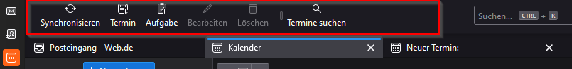
New appointment action bar
OS: Windows 11 Pro (23H2) Tb Version: 115.9.0 (64-Bit)
This is more a design question. With the Supernove release you moved the search bar and action icon into the top of the window. So on the email and calendar tab all the buttons are now on the very top next to search bar.
I configured to create new appointments in a new tab, not an extra window. But in this appointment tab the action buttons are in a seperate action bar below the tabs for email and calendar and not next to the search bar on top like I would have expected it according to the new design. I added screenshot to describe better what I mean. Is it planned to move the action buttons to the top for the new apointment tab?`
In general it is a bit annoying that the height of the toolbar on top varies. Like if there are buttons and you choose "show text below symbols" for it the toolbar is higher, of course. But then if you have a tab without symbols, e.g. the settings-tab or the new appointment tab, the height of the toolbar reduces. It would be great if this could be standardized.
所有回复 (4)
re :With the Supernove release you moved the search bar and action icon into the top of the window.
That's the 'Unified Toolbar'
BTW - If you want the Menu Bar toolbar on top then use info at this link: https://support.mozilla.org/en-US/questions/1422908
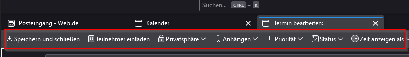
re :I configured to create new appointments in a new tab, not an extra window. But in this appointment tab the action buttons are in a seperate action bar below the tabs for email and calendar and not next to the search bar
That's because the 'Unified Toolbar' can be customised for: 'Mail' , 'Address Book', 'Calendar', 'Tasks', 'Chat' and 'Settings'. But not an Event. Hence you only see the specific toolbar for Event in the Event tab. This is necessary because that view in the 'Event' Tab must also be available if viewed in a separate window which does not contain a 'Unified Toolbar'.
Why a new design if it is not consistently implemented? I don't need 27 different toolbars depending on which module is used in which mode. If I use something in tab mode, then the associated buttons should be in the 'Unified Toolbar', if I use it in 'separate window' mode, the buttons must be in the window. Otherwise you can leave it alone.
yeah, supernova is at best a starting point. Personally I think those responsible bit of much more than they could chew with supernova and by the time they worked out just what they had done, it was too big a job to back out of it.
Each release will see improvement in the consistency of the user interface, at least I hope so. But really they still have not done implementing the card view to use instead of the list view for emails. See https://developer.thunderbird.net/planning/roadmap
Note especially the bit about "out of scope" which includes the entire calendar.
I quote part of the link here
As we focus on these primary objectives with the goal of bringing them to full completion, as well as making sure we have enough resources to tackle bug reports and regressions, we won't be dedicating any major commitment to the following areas of the application during this year. Calendar Chat Tasks Settings Compose Search and everything else...
If you have feedback or ideas, there is a link on Thunderbird's help menu for that. It will take you to this location. https://connect.mozilla.org
daniel322 said
Why a new design if it is not consistently implemented? I don't need 27 different toolbars depending on which module is used in which mode. If I use something in tab mode, then the associated buttons should be in the 'Unified Toolbar', if I use it in 'separate window' mode, the buttons must be in the window. Otherwise you can leave it alone.
I'm not disagreeing with you. I'm just stating how things are at the moment. I'm just another user like yourself. The developers do not get involved with the Support Forum, so there's no point in stating what you want to happen in this forum. If I knew some code which would fix it via using a 'userChrome.css' file then I would have offered the info, but in this case I don't believe it's possible.
Hopefully, as Matt has stated, the developers will get around to improving things as time goes by.