

Firefox(iOS) interface layout needs another design to speed up operation flow
(sorry for my poor English)
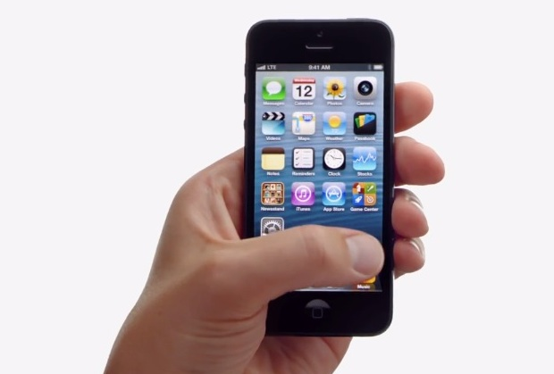
While using firefox on iPhone held in my left palm, it's not to reach the button in the upper-right corner.
We always grip our phones like this: (a1-i5.jpg) (a2-i6.png)
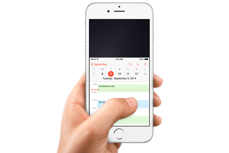
So, the button in the upper-right corner is not easy for our left thumb. a3-hard-to-reach.png
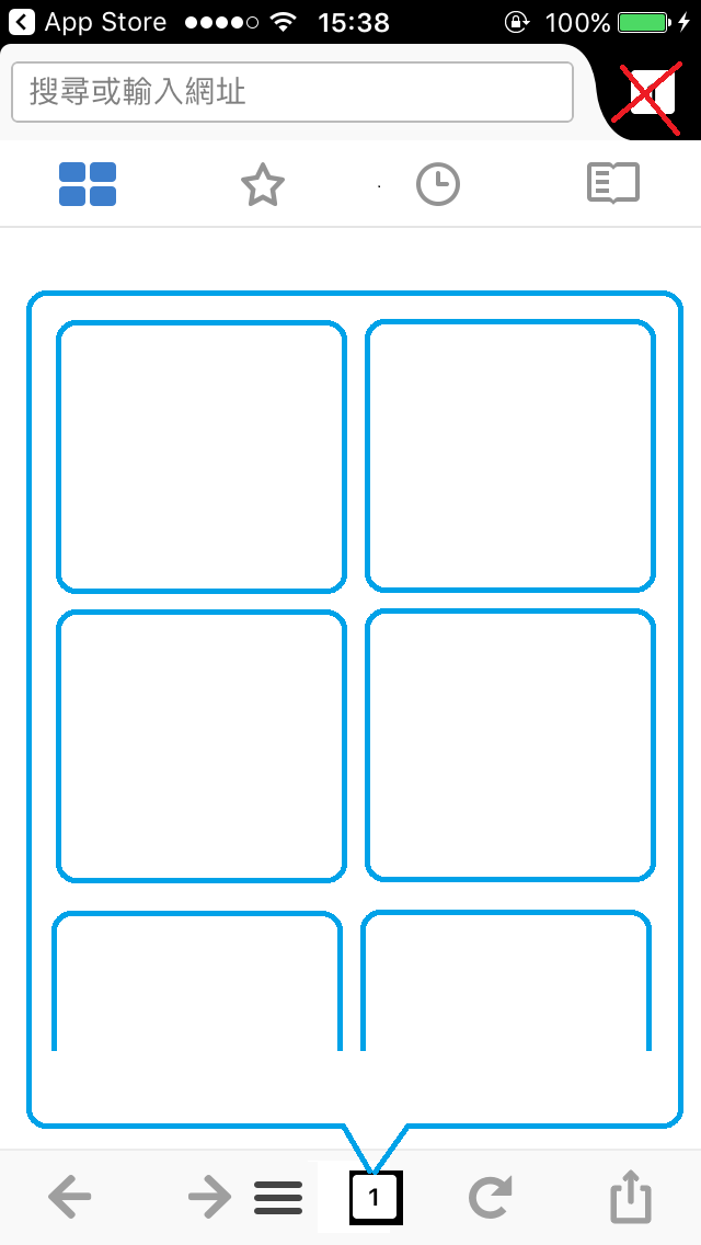
I suggest that move it to the bottom bar like this: (a41-sugg.png)
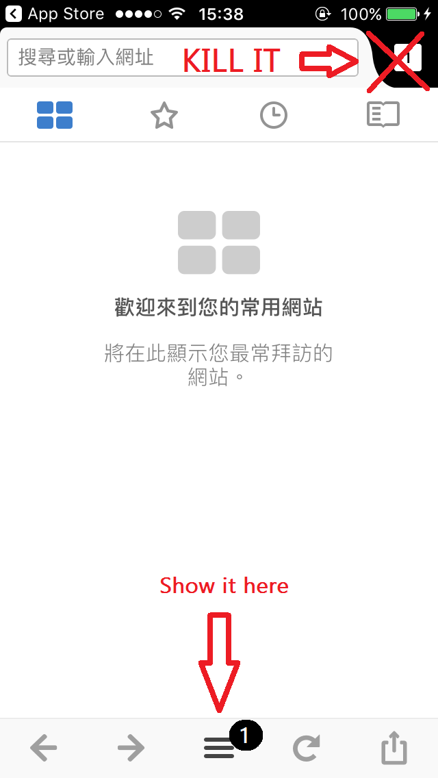
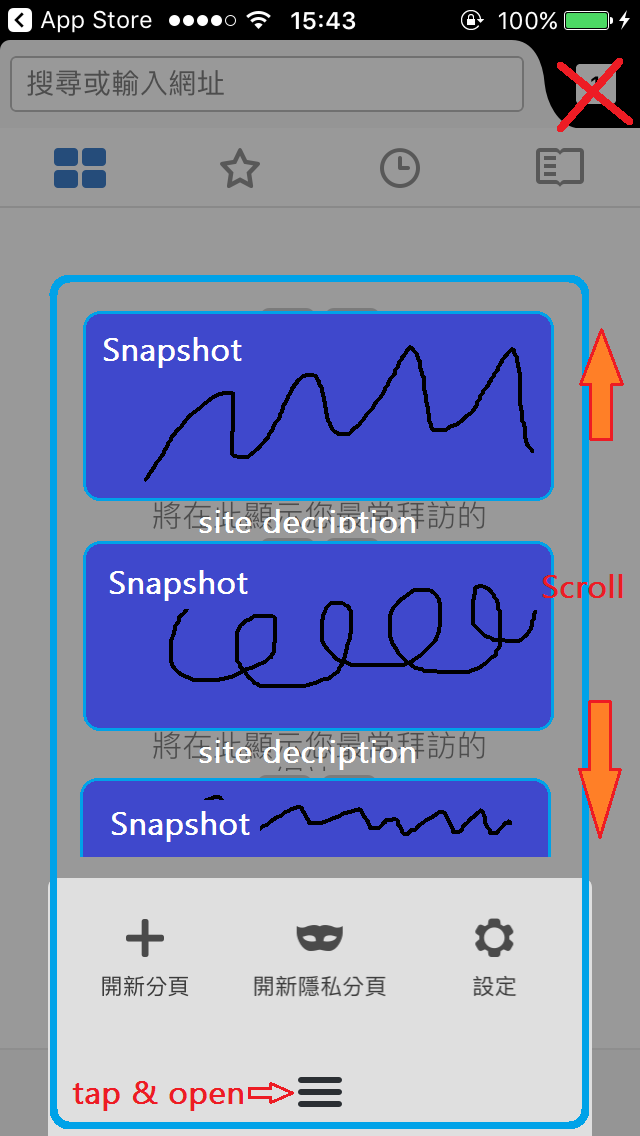
And this: (a42-sugg.png) Showing tabs in the function button panel, that might be much more immediate.
merge the number badge into the function button, or not, put it neighboring to the function button. (a43-sugg.png)
Anyway, the key idea is make it to be much more friendly to use with one hand, then your other hand can do something else, writing or holding a mug.
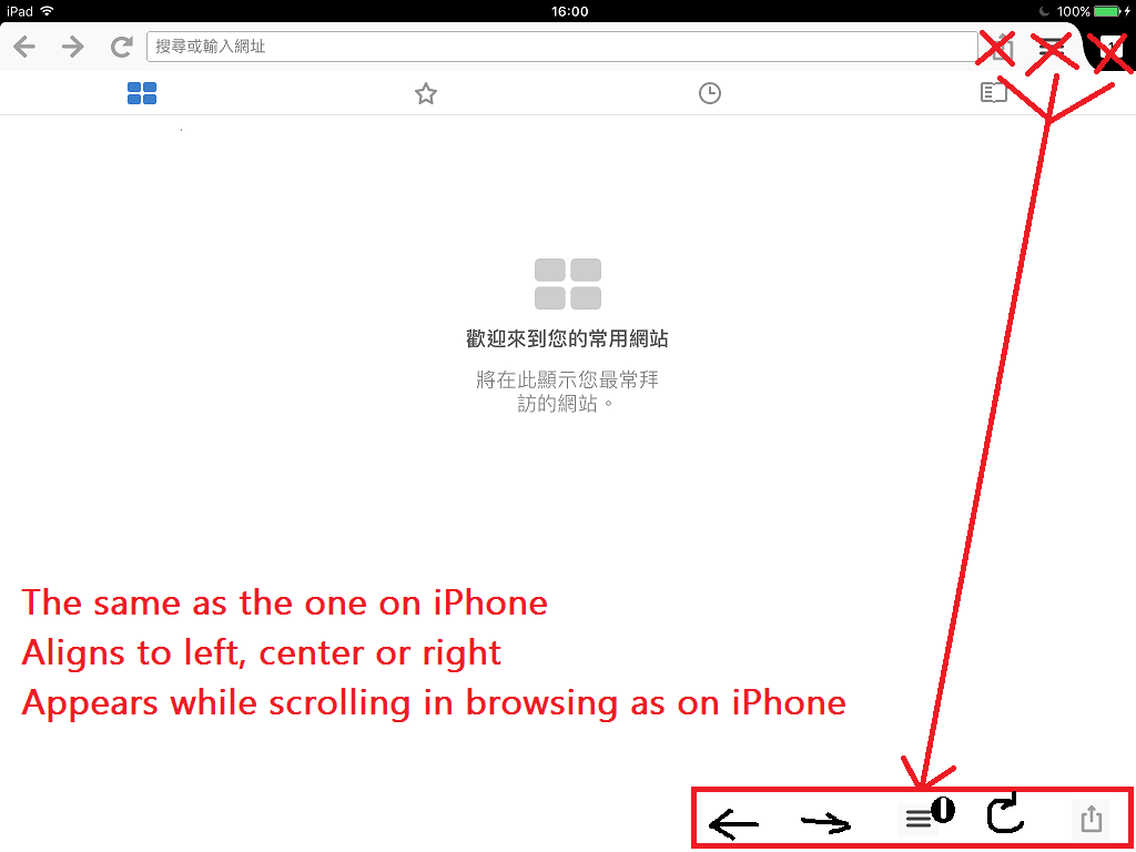
And on iPad, make the operational logic the same as on iPhone.
A bottom bar aligns to left, center or right. (b1-bottom-bar.png)
That let users raise hand less, and the display would not be covered by palm.
And imagine that: You iPad is standing on your desk as a photo frame, then you can put your wrist on the desk and tap the function easily.
And the last point, please consider to enhance the gesture on iPad.


Усі відповіді (1)
You may submit feedback directly to the Advocacy team through the following page:
The User Advocacy team reviews all feedback and reports on the findings to the product teams and relevant parties, helping to influence and shape our products.