

CSS style the "Bookmark This Page" popup - move labels
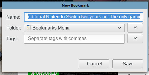
Using CSS, is it possible to move elements like labels from one row to another on an object like the "Bookmark This Page" popup - as the one in Fx 65? Or another relatively simple way? See screenshot w/ labels beside data fields.
Several versions ago & still in Fx ESR 60.x versions, the labels were logically beside the entry fields.
Putting labels on their own rows wastes too much vertical space, that's better used to show more expanded bookmarks treeview. I don't think widening the bookmark panel is much trouble.
I could reclaim a little space by hiding some labels & resizing their rows. I need keep labels "Tags" and "Keyword" - either as is, or moved to the left of their data field.
글쓴이 JoeB 수정일시
모든 댓글 (3)
Which css are you using and the site you got it from?
Not a person in all of Mozilla land knows what would be needed to move labels to the same line as the field they describe?
@WestEnd - uh, could you give more details of what you're looking for? CSS for what - the bookmark panel w/ labels beside the entry field? If that's what you're asking - I didn't get CSS for it. That's the way it was in previous versions & the way it still is in Fx 60.x ESR.
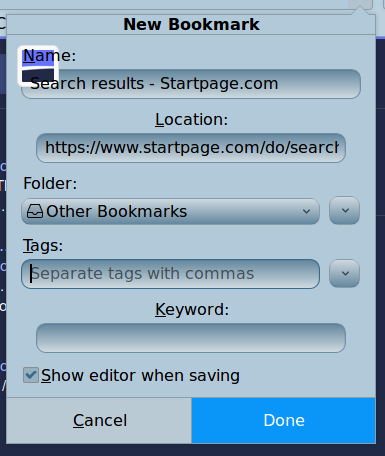
I think the html for the bookmark panel (popup) would have to be modified so the labels are on the same line as the text field & expander buttons. Looking at how the html code for a single row (say, name row: vbox id="BMPanel_nameRow") in Fx 60 ESR is written vs. quantum 65.x. jscher should be able to knock that out in 15 min.
I haven't looked into what you'd do with the modified html code, even if you got the syntax correct, given differences in html code of the ESR vs. regular Fx versions.
As far as reducing the huge wasted space on the latest bookmark panel, I shrunk it a good bit - removing a lot of padding or margins on elements.
Reducing height of text fields (but same font size), reducing height of the Cancel & Done buttons (that look like old "big key cell phones" marketed to seniors) and reducing a few other objects and / or spacing to reasonable sizes.
Then you can considerably increase the expanded size of the bookmarks treeview. Note: I also made a couple of rows on the panel visible that are hidden by default.
IMO, your expectations of the support contributors here is too high.
Look for the CSS you need here: https://www.reddit.com/r/FirefoxCSS/