
userChrome.css - Help With Customizing Tabs (part 2)
Hi All,
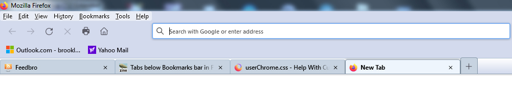
I would like the content area of my tabs moved up so that the box is filled with the actual tab color, without the white background, and also the text will be vertically centered. Right now, the text is dropping too close to the bottom of the tab.
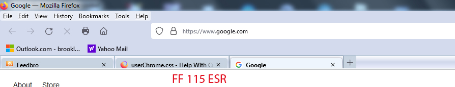
Had this looking very nice in FF 88 with the same code, as you can see in the attached images, but it seems to render differently in FF 115 ESR and FF 125.
Below is some code I used to style the tabs, but the problem exists without this code as well.
I've also included some "tabs on bottom" code I'm using as well at the very bottom.
Would sure like to get those Classic Toolbar Buttons working again too (shown in the second image), but that will be a later request :)
Any help is appreciated.
Thanks!
/* Highlight non-selected tabs on mouseover */ .tabbrowser-tab:not([selected]):hover .tab-content {
background-color: #dbe3eb !important;
}
- TabsToolbar {
 -moz-box-ordinal-group: 3 !important;
 padding-top: 0 !important;
 padding-bottom: 0 !important;
 height: 25px !important;
 background-image: url("bkmr_back.gif") !important;
 border-top: 1px solid #afc0d2 !important;
 border-bottom: 1px solid #8698aa !important;
}
/* Background color of selected tab */ .tab-background[selected="true"] {
   background-attachment: none!important;
   background-image: none!important;
   background-color: #eef5fc !important;
}
/* Background color of non-selected tab */ tab-background:not([selected]) {
   color: #000000 !important;
   background-color: #c7d3e0 !important;
}
/* Border color & bold text for selected tab */
- TabsToolbar .tabbrowser-tab[selected] {
   font-weight: 700 !important;
   color: #000 !important;
   border-top: 1px solid #8698aa !important;
   border-left: 1px solid #8698aa !important;
   border-right: 1px solid #8698aa !important;
}
/* Border color & normal text for non-selected tab */
- TabsToolbar .tabbrowser-tab:not([selected]) {
   font-weight: 600 !important;
   color: #000 !important;
   border-top: 1px solid #afc0d2 !important;
   border-left: 1px solid #afc0d2 !important;
   border-right: 1px solid #afc0d2 !important;
}
/* -------------- TABS ON BOTTOM --------------- */ /* TABS: below nav-bar - updated for 89+ | 108+ | 113+ */
- |*:root {
 --tab-toolbar-navbar-overlap: 0px !important;
 --tab-min-height: 25px !important; /* adjust */
 --tab-min-width:  80px !important; /* adjust */
}
- navigator-toolbox #TabsToolbar {
 position: absolute !important;
 bottom: 0;
 /* height: 27px !important; */
 height: 28px !important;
 width: 100vw !important;
}
/* navigator-toolbox - padding */
- |*:root:not([chromehidden*="toolbar"]) #navigator-toolbox {
 position: relative !important; /*89+*/
 padding-bottom: calc(var(--tab-min-height) + 1px) !important; /*adjust*/
 background-color: var(--toolbar-bgcolor) !important;
}
/* TABS: HEIGHT */
- tabbrowser-tabs,
- tabbrowser-arrowscrollbox,
- tabbrowser-tabs .tabbrowser-tab {
 min-height: var(--tab-min-height) !important;
 max-height: var(--tab-min-height) !important;
}
.tab-stack {
height: var(--tab-min-height) !important;
}
- TabsToolbar {
 height: var(--tab-min-height) !important;
 margin-bottom: 0px !important;
 /* box-shadow: ThreeDShadow 0 -1px inset, -moz-dialog 0 1px !important; /*optional*/
 /* background-color: var(--toolbar-bgcolor) !important; */
 color: var(--toolbar-color) !important;
}
/* drag space */ .titlebar-spacer[type="pre-tabs"], .titlebar-spacer[type="post-tabs"] {
width: 40px;
}
/* Override vertical shifts when moving a tab */
- navigator-toolbox[movingtab] > #titlebar > #TabsToolbar {
padding-bottom: unset !important;
}
- navigator-toolbox[movingtab] #tabbrowser-tabs {
 padding-bottom: unset !important;
 margin-bottom: unset !important;
}
- navigator-toolbox[movingtab] > #nav-bar {
margin-top: unset !important;
}
/* hide indicators and caption buttons */
- TabsToolbar .private-browsing-indicator {display: none !important;}
- TabsToolbar .accessibility-indicator {display: none !important;}
- TabsToolbar .titlebar-buttonbox-container {display: none !important;}
- TabsToolbar #window-controls {display: none !important;}
/* -------------- TABS ON BOTTOM --------------- */

ჩასწორების თარიღი: , ავტორი: Slouch
გადაწყვეტა შერჩეულია
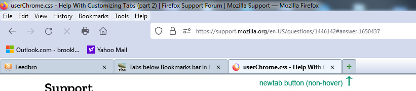
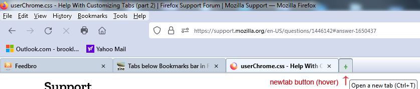
I found a solution for highlighting my "newtab" button on hover.
The problem was only the button itself was being highlighted, not the '+' SVG image inside the button, or in my case the custom .PNG image of the green '+' sign.
It appears I needed the 2 statements at the bottom of this code to handle the task. I don't think it was so complex to do in FF 88, but apparently lots of things have changed.
If there is a better way to do this, I welcome comments.
#tabs-newtab-button {
   padding: 4px !important;
   list-style-image: url("newtab_18x18.png") !important;
   background-color: #c7d3e0 !important;
   border-top-left-radius: 3px !important;
   border-top-right-radius: 3px !important;
   border-top: 1px solid #8698aa !important;
   border-left: 1px solid #8698aa !important;
   border-right: 1px solid #8698aa !important;
   margin-top: 4px !important;
   margin-bottom: -3px !important;
}
#tabs-newtab-button:hover { background-color: #dbe3eb !important }
#tabs-newtab-button:hover > .toolbarbutton-icon { background-color: #dbe3eb !important }
პასუხის ნახვა სრულად
👍 0
ყველა პასუხი (20)
Hi Slouch, this website is not good with pasted CSS, since it looks like wiki markup.
Also, more generally, style customization isn't officially supported so here are some better forums for this request:
Hello Jscher2000,
Should I delete my post?
This is the first time I've been told to go elsewhere, after years of receiving help on this site.
Thanks.
You have some rules for the height that conflict with the rules for Tabs below the Navigation Toolbar. Remember that best is to use --tab-min-height overall. I've added a section to adjust the padding-bottom for icon and label at the top that you can use to move those items up.
/* Tab Bar styling for Firefox 115 */
/* TABS: padding */
#tabbrowser-tabs {border-left: 1px threedshadow solid;}
#tabbrowser-tabs .tab-icon-stack  {padding-bottom: 5px !important}
#tabbrowser-tabs .tabbrowser-tab .tab-label-container {padding-bottom: 5px !important; height: var(--tab-min-height) !important;}
#tabbrowser-tabs .tabbrowser-tab .tab-close-button {padding-block: 0px 3px !important;}

/* Highlight non-selected tabs on mouseover */
.tabbrowser-tab:not([selected]):hover .tab-content {
   background-color: #dbe3eb !important;
}

#TabsToolbar {
  height: var(--tab-min-height) !important;
  background-image: url("bkmr_back.gif") !important;
  border-top: 1px solid #afc0d2 !important;
  border-bottom: 1px solid #8698aa !important;
}

/* Background color of selected tab */
.tab-background[selected] {
    background-attachment: none!important;
    background-image: none!important;
    background-color: #eef5fc !important;
}

/* Background color of non-selected tab */
tab-background:not([selected]) {
    color: #000000 !important;
    background-color: #c7d3e0 !important;
}

/* Border color & bold text for selected tab */
#TabsToolbar .tabbrowser-tab[selected] .tab-background {
    font-weight: 700 !important;
    color: #000 !important;
    border-top: 1px solid #8698aa !important;
    border-left: 1px solid #8698aa !important;
    border-right: 1px solid #8698aa !important;
}

/* Border color & normal text for non-selected tab */
#TabsToolbar .tabbrowser-tab:not([selected]) .tab-background {
    font-weight: 600 !important;
    color: #000 !important;
    border-top: 1px solid #afc0d2 !important;
    border-left: 1px solid #afc0d2 !important;
    border-right: 1px solid #afc0d2 !important;
}

/* -------------- TABS ON BOTTOM --------------- */
/* TABS: below nav-bar - updated for 89+ | 108+ | 113+ */

*|*:root {
  --tab-toolbar-navbar-overlap: 0px !important;
  --tab-min-height: 25px !important; /* adjust */
  --tab-min-width:  80px !important; /* adjust */
}

#navigator-toolbox #TabsToolbar {
/*  display: block !important; *//*not needed in 113+: display: flex*/
  position: absolute !important;
  bottom: 0;
  width: 100vw !important;
}

/* navigator-toolbox - padding */
*|*:root:not([chromehidden*="toolbar"]) #navigator-toolbox {
  position: relative !important; /*89+*/
  padding-bottom: calc(var(--tab-min-height) + 1px) !important; /*adjust*/
  background-color: var(--toolbar-bgcolor) !important;
}

/* TABS: HEIGHT */
#tabbrowser-tabs {
  min-height: var(--tab-min-height) !important;
  max-height: var(--tab-min-height) !important;
}

#TabsToolbar {
  height: var(--tab-min-height) !important;
  margin-bottom: 0px !important;
  /* box-shadow: ThreeDShadow 0 -1px inset, -moz-dialog 0 1px !important; /*optional*/
  /* background-color: var(--toolbar-bgcolor) !important; */
  color: var(--toolbar-color) !important;
}

/* drag space */
.titlebar-spacer[type="pre-tabs"],
.titlebar-spacer[type="post-tabs"] {
  width: 40px;
}

/* Override vertical shifts when moving a tab */
#navigator-toolbox[movingtab] > #titlebar > #TabsToolbar {
  padding-bottom: unset !important;
}
#navigator-toolbox[movingtab] #tabbrowser-tabs {
  padding-bottom: unset !important;
  margin-bottom: unset !important;
}
#navigator-toolbox[movingtab] > #nav-bar {
  margin-top: unset !important;
}

/* hide indicators and caption buttons */
#TabsToolbar .private-browsing-indicator   {display: none !important;}
#TabsToolbar .accessibility-indicator      {display: none !important;}
#TabsToolbar .titlebar-buttonbox-container {display: none !important;}
#TabsToolbar #window-controls              {display: none !important;}

/* -------------- TABS ON BOTTOM --------------- */
Hi cor-el,
Thanks for your reply.
I've taken out all hard-coded height values, and left only the --tab-min-height variables. Should not be any conflicts now.
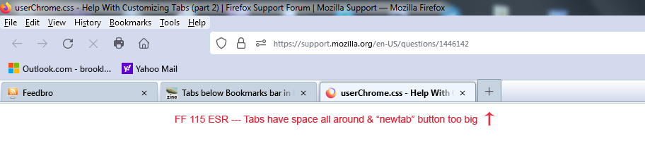
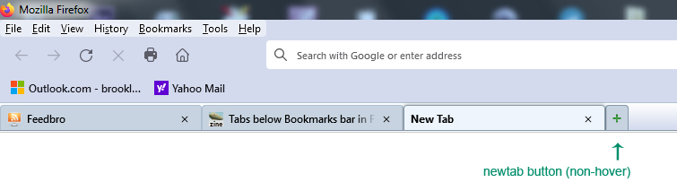
My "newtab" button is too big, however. It should be the same height as the rest of the tabs. Is there a way to correct this?
Also, is there a way to remove the extra space around and between the tabs so they are flush together? See the image of my FF 88 for how tight the tabs fit together.
My entire userChrome.css is below.
Thanks again :)
@namespace url("http://www.mozilla.org/keymaster/gatekeeper/there.is.only.xul"); /* set default namespace to XUL */

/* tab loading wheel image */
.tab-throbber[busy]::before {
  background-image: url("image/tabthrobber_loading-fx39.png") !important;
  animation: unset !important;
}

/* ---------- SPLIT RELOAD BUTTON INTO RELOAD & STOP ------------- */
#reload-button, #stop-button {
display: inherit !important;
}
#reload-button > .toolbarbutton-icon {
-moz-appearance: none !important;
}
/* ---------- SPLIT RELOAD BUTTON INTO RELOAD & STOP END ------------- */

/* ---------- MAKE CHEVRON A LITTLE SMALLER ------------ */
#PlacesChevron {
  padding: 5px !important;
}

#PlacesChevron .toolbarbutton-icon {
  min-width: 0px !important;
  min-height: 0px !important;
  width: 18px !important;
  height: 18px !important;
}
/* ---------- MAKE CHEVRON A LITTLE SMALLER END ------------ */

#nav-bar { /* main toolbar - icons with text */   /* swap */
  -moz-box-ordinal-group: 1 !important;
  box-shadow: none !important;
  background-color: #d3daed !important;
}
#PersonalToolbar {  /* swap */
	background-color: #d3daed !important;
}
#personal-bookmarks .toolbarbutton-text,
#personal-bookmarks .menu-iconic-text,
#personal-bookmarks .openintabs-menuitem {
  font-weight: 600 !important;
}

#PersonalToolbar{
  --toolbarbutton-hover-background: #bfc5d6;
}

.urlbar-input-box {
   font-size: 11px !important;
   font-weight: 600 !important;
   letter-spacing: 2px !important;
}

#toolbar-menubar, #menubar-items, #main-menubar { /* swap */
  background-color: #d3daed; /* was e6f0fb */
}
/* Clean up spacing */
.titlebar-placeholder {
  display: none !important;
}
toolbarbutton.bookmark-item {
  padding-top: 2px !important;
  padding-bottom: 2px !important;
}

menupopup > menuitem, menupopup > menu {
padding-block: 1px !important;
}

/* -------------- TABS ON BOTTOM --------------- */
/* TABS: below nav-bar - updated for 89+ | 108+ | 113+ */

*|*:root {
  --tab-toolbar-navbar-overlap: 0px !important;
  --tab-min-height: 32px !important; /* adjust */
  --tab-min-width:  80px !important; /* adjust */
}

#navigator-toolbox #TabsToolbar {
/*  display: block !important; *//*not needed in 113+: display: flex*/
  position: absolute !important;
  bottom: 0;
  width: 100vw !important;
}

/* navigator-toolbox - padding */
*|*:root:not([chromehidden*="toolbar"]) #navigator-toolbox {
  position: relative !important; /*89+*/
  padding-bottom: calc(var(--tab-min-height) + 1px) !important; /*adjust*/
  background-color: var(--toolbar-bgcolor) !important;
}

/* TABS: HEIGHT */
#tabbrowser-tabs,
#tabbrowser-arrowscrollbox,
#tabbrowser-tabs .tabbrowser-tab {
  min-height: var(--tab-min-height) !important;
  max-height: var(--tab-min-height) !important;
}

.tab-stack {
  height: var(--tab-min-height) !important;
}

#TabsToolbar {
  height: var(--tab-min-height) !important;
  margin-bottom: 1px !important;
  /* box-shadow: ThreeDShadow 0 -1px inset, -moz-dialog 0 1px !important; */ /*optional*/
  background-color: var(--toolbar-bgcolor) !important;
  color: var(--toolbar-color) !important;
}

/* drag space */
.titlebar-spacer[type="pre-tabs"],
.titlebar-spacer[type="post-tabs"] {
  width: 40px;
}

/* Override vertical shifts when moving a tab */
#navigator-toolbox[movingtab] > #titlebar > #TabsToolbar {
  padding-bottom: unset !important;
}
#navigator-toolbox[movingtab] #tabbrowser-tabs {
  padding-bottom: unset !important;
  margin-bottom: unset !important;
}
#navigator-toolbox[movingtab] > #nav-bar {
  margin-top: unset !important;
}

/* hide indicators and caption buttons */
#TabsToolbar .private-browsing-indicator   {display: none !important;}
#TabsToolbar .accessibility-indicator      {display: none !important;}
#TabsToolbar .titlebar-buttonbox-container {display: none !important;}
#TabsToolbar #window-controls              {display: none !important;}

/* -------------- TABS ON BOTTOM --------------- */

/* New Tab Button */
#tabs-newtab-button
{
   /* color: #fff !important; */
   margin: unset !important;
   padding: unset !important;

   background-color: #c7d3e0 !important;
   border-top-left-radius: 2px !important;
   border-top-right-radius: 2px !important;
   border-top: 1px solid #8698aa !important;
   border-left: 1px solid #8698aa !important;
   border-right: 1px solid #8698aa !important;
}

#new-tab-button:hover,
#tabs-newtab-button:hover {
  /* fill: white !important; */
   background-color: #dbe3eb !important;
}

/* ------------- MORE MODS --------------------------------------------- */

/* highlight non-selected tabs on mouseover */
.tabbrowser-tab:not([selected]):hover .tab-background {
   background-color: #dbe3eb !important;
}

#TabsToolbar { /* tab bar */
  -moz-box-ordinal-group: 3 !important;
  padding-top: 0 !important;
  padding-bottom: 0 !important;
  background-image: url("bkmr_back32.gif") !important;
  border-top: 1px solid #afc0d2 !important;
  border-bottom: 1px solid #8698aa !important;
}

/* Change the color of selected tab */
.tab-background[selected="true"] {
    background-attachment: none!important;
    background-image: none!important;
	background-color: #eef5fc !important; /* background color only, not border */
}

/* Change text attributes of selected tab #8698aa to match bottom tabstoolbar line color */
#TabsToolbar .tabbrowser-tab[selected] {
	font-weight: 700 !important;
	color: #000 !important;
}
#TabsToolbar .tabbrowser-tab[selected] .tab-background {
	border-top: 1px solid #8698aa !important;
    border-left: 1px solid #8698aa !important;
    border-right: 1px solid #8698aa !important;
	padding:0px !important;
	padding-bottom: 3px !important;
}

#TabsToolbar .tabbrowser-tab:not([selected]) {
	font-weight: 600 !important;
	color: #000 !important; /* non-selected tab text color */
}
#TabsToolbar .tabbrowser-tab:not([selected]) .tab-background {
    border-top: 1px solid #afc0d2 !important;
    border-left: 1px solid #afc0d2 !important;
    border-right: 1px solid #afc0d2 !important;
    padding:0px !important;
	padding-bottom: 3px !important;
}

/* Change the color of non-selected tab */
   .tab-background:not([selected]) {
    color: #000000 !important;
	background-color: #c7d3e0 !important;
}

#urlbar, #searchbar {--toolbar-field-background-color: white !important;}

/* ------------- MORE MODS END ----------------------------------------- */

.tab-close-button { width: 16px !important; height: 16px !important; padding: 3px !important; margin: 3px !important; }

#tabbrowser-tabs .tabbrowser-tab .tab-label-container {padding-bottom: 3px !important; height: 28 px !important;}
ჩასწორების თარიღი: , ავტორი: cor-el

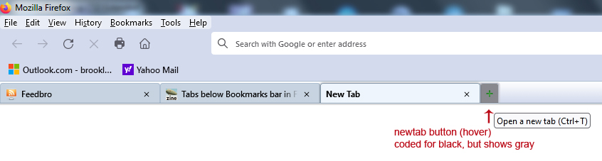
Also, the "newtab" button is the wrong color when I hover over it. Should be #dbe3eb the way I have it coded. Instead, the color changes to #d3d6de (slightly more red) when I mouseover it. Strange behavior. The regular tab buttons show the correct color (#dbe3eb) when I hover over them.
Hi Slouch, does it help to select compact density? See: https://www.userchrome.org/firefox-89-styling-proton-ui.html#compactmode
Hello jscher2000,
Actually, no, all that does is condense the toolbar navigation buttons, makes them closer together.
But it doesn't affect the tab bar at all.
To let it affect the Tab bar, you would have to remove the --tab-min-height setting.
You can make the new tab button lower by adding a margin-top value (you missed #new-tab-button used when the tabs overflow).
/* New Tab Button */
#new-tab-button, #tabs-newtab-button {
   background-color: #c7d3e0 !important;
   border-top-left-radius: 2px !important;
   border-top-right-radius: 2px !important;
   border-top: 1px solid #8698aa !important;
   border-left: 1px solid #8698aa !important;
   border-right: 1px solid #8698aa !important;
   margin-block: 4px 0px !important;
}

#new-tab-button:hover, #tabs-newtab-button:hover {
  /* fill: white !important; */
   background-color: #dbe3eb !important;
}
You can remove the space between the tabs with this rule:
#tabbrowser-tabs .tabbrowser-tab {padding-inline: 0px 0px !important}
I'm not sure why you have that rule for the tab close button with adding that much padding and margin.
.tab-close-button { width: 16px !important; height: 16px !important; padding: 3px !important; margin: 3px !important; }
I see still "=true" in .tab-background[selected="true"] that will cause a problem if you would want to use the code in release.
I think I found the cause of the extra-large "newtab" button.
When I remove the 2 lines (height and max-height) below, it appears normal.
- tabs-newtab-button
{
  margin: unset !important;
  padding: unset !important;
  height: var(--tab-min-height) !important;
  max-height: var(--tab-min-height) !important;
  background-color: #c7d3e0 !important;
  border-top-left-radius: 4px !important;
  border-top-right-radius: 4px !important;
  border-top: 1px solid #8698aa !important;
  border-left: 1px solid #8698aa !important;
  border-right: 1px solid #8698aa !important;
}
Correction, it only appears normal when I remove this whole "newtab" section I have. It's not just the "height" statements. Something in here is causing it...
- tabs-newtab-button
{
  margin: unset !important;
  padding: unset !important;
  height: var(--tab-min-height) !important;
  max-height: var(--tab-min-height) !important;
  background-color: #c7d3e0 !important;
  border-top-left-radius: 4px !important;
  border-top-right-radius: 4px !important;
  border-top: 1px solid #8698aa !important;
  border-left: 1px solid #8698aa !important;
  border-right: 1px solid #8698aa !important;
}
- new-tab-button:hover,
- tabs-newtab-button:hover {
background-color: #dbe3eb !important;
}
Hi cor-el,
Your "padding-inline" statement did solve the issue with spaces around the tabs (see image). Thank you :)
Now there's just the little bit of space above the tabs, and the large "newtab" button to solve.
Hi cor-el,
In response to your statement "I'm not sure why you have that rule for the tab close button with adding that much padding and margin." ...
I'm not sure either :)
I found that rule online to try to solve some other issue which no longer exists. I removed the line as it has no effect now.
As for the [selected="true"] parameter, I do not plan on using any code in release, it's just for my personal use. I will remove any deprecated code as a final step. Just trying to get the right look & feel for now.
And you're right, I was using the wrong tag for the new tab button.
I should have used new-tab-button instead of newtab-button (forgot the hyphen).
Things are shaping up more. Thank you. See image attached.
Now, when I hover over the new-tab button it appears in a slightly different color than what I coded. Also, the custom image I'm using with the '+' sign is a bit compressed vertically, which I can live with.
Here is my current "newtab" button section...
/* New Tab Button */
- new-tab-button, #tabs-newtab-button
{
 list-style-image: url("newtabff1.png") !important;
 -moz-image-region: rect(2px, 15px, 16px, 1px) !important;

  margin: unset !important;
  padding: unset !important;
  background-color: #c7d3e0 !important;
  border-top-left-radius: 4px !important;
  border-top-right-radius: 4px !important;
  border-top: 1px solid #8698aa !important;
  border-left: 1px solid #8698aa !important;
  border-right: 1px solid #8698aa !important;
  margin-block: 4px 0px !important;
}
- new-tab-button:hover,
- tabs-newtab-button:hover {
background-color: #dbe3eb !important;
}

Note: Support for '-moz-image-region' has been removed in Firefox 112, so you can no longer use a sprite with multiple images. Support for '-moz-box-ordinal-group' has been removed in Firefox 113, use 'order' with a value one less.
Thank you cor-el.
I've removed all '-moz-box-ordinal-group' references and the -moz-image-region.
That's a shame about the sprites. That means no more classic toolbar buttons.
Can I condense the tab bar to close up the tiny white space above my tabs?
And maybe remove the shadow around the selected tab?
ჩასწორების თარიღი: , ავტორი: Slouch
Also, I coded the hover background color of the newtab button in black to illustrate a point.
When I hover over the newtab button, it shows a dark gray background color, instead of black. And the border also looks a bit strange, like a larger button is overlaying it.
Am I doing something wrong here?
See attached images for both the hover and non-hover state.
Here is my current "newtab" button code...
/* New Tab Button */
- new-tab-button, #tabs-newtab-button
{
list-style-image: url("newtabff1.png") !important;
background-color: #c7d3e0 !important;
border-top-left-radius: 4px !important;
border-top-right-radius: 4px !important;
border-top: 1px solid #8698aa !important;
border-left: 1px solid #8698aa !important;
border-right: 1px solid #8698aa !important;
max-width: 26px !important;
margin-block: 4px 0px !important; /* dunno why - still need this to push new tab button down */
}
- new-tab-button:hover,
- tabs-newtab-button:hover {
/* background-color: #dbe3eb !important; */
background-color: #000 !important; /* black - to test hover state */
}
ჩასწორების თარიღი: , ავტორი: Slouch
I was able to remove the shadow of the selected tab with this line...
.tab-background{ box-shadow: none !important; }
The newtab button is almost working now - changes to the correct color when hovering over it. I found I had to repeat the same block of code using the additional .toolbarbutton-icon parameter.
But the button shrinks down a bit (possibly revealing a darker button behind it) and my '+' image gets compressed.
Please see attached images (hover & non-hover).
Here is my latest newtab code...
/* New Tab Button */
- new-tab-button, #tabs-newtab-button
{
  list-style-image: url("newtabff1.png") !important;

  background-color: #c7d3e0 !important;
  border-top-left-radius: 4px !important;
  border-top-right-radius: 4px !important;
  border-top: 1px solid #8698aa !important;
  border-left: 1px solid #8698aa !important;
  border-right: 1px solid #8698aa !important;
  max-width: 28px !important;
  margin-block: 4px 0px !important;
}
- new-tab-button:hover,
- tabs-newtab-button:hover .toolbarbutton-icon {
  background-color: #dbe3eb !important;
  border-top-left-radius: 4px !important;
  border-top-right-radius: 4px !important;
  border-top: 1px solid #8698aa !important;
  border-left: 1px solid #8698aa !important;
  border-right: 1px solid #8698aa !important;
  max-width: 28px !important;
  margin-block: 4px 0px !important;
}