

To, CC and BCC
I've read a lot of help on this - almost all of them say, "As you have discovered there are three visible TO/Cc/Bcc fields..." and: " type or select email address and press enter to move to next TO field".
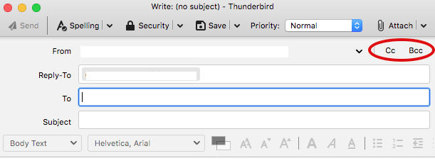
None of that works. I have only ONE visible "To" field. It has no controls to change it to a Cc or Bcc one. There is a "CC" or "BCC" option beside the "From" field. Pressing Enter at the end of an address does precisely nothing.
Another copy of TB on another computer has all the features you gaily point to - but mine doesn't. Where do I find it?
Mafitar da aka zaɓa
Thunderbird 78 has changed compared to Thunderbird 68, that's why you see this discrepancy. In 68, the field name is a dropdown list, and you can change To to CC/BCC. In 78, however, you can add CCs and BCCs by clicking on the text buttons beside the To field.
Karanta wannan amsa a matsayinta 👍 1All Replies (20)
Nspagforums said
to all, QUESTION in general IF the TO: field allows multiple recipients, IS A CC: field actually needed? after all, if you USE CC:, the TO: recipients SEE the CC: recipients anyway. SO, you wuold just need the TO: field, AND the BCC: field, present at all times, ??
Yes, CC is needed. Specifically because my boss uses CC to filter his email and would be upset if he started getting TO emails for the hundreds he receives everyday :)
Many thanks for your reply. But I'm still... I'm still astonished, astonished beyond belief and, well... Anyway, I think this is a tottaly unjustified change. I wonder what excuse could ever be for such an unintuitive feature.
As usuall, I thought I should search the internet with the keywords thunderbird cc not working What about all those who are yet to realize how to find anything on internet?
I finally found the unintuitively placed Cc and Bcc controls located in the upper right corner of the compose email pane. Why did they get moved to the right size instead of remaining on the left?
My 2¢ on the to, cc and bcc debacle. Changing the email addressing in 78.4 is ill-conceived. As an example, when sending to a long list, the former presentation was easy to curate the recipient type: simply look down the left column and verify the correct setting per recipient or click to change it. This new, and IMHO not improved, version requires studying a paragraph of what looks like email tiles (think Mahjong) and sliding them into the correct category. Not to mention the extra and formerly unnecessary step of activating the cc or bcc categories in every email. Business email isn't a game but apparently Thunderbird wants it to be one.
Frankly, I can't imagine how the development team thought the new scheme is an improvement. What this change reeks of is programmers looking for things to do. Seriously, we've had viable email for decades and frankly, just like 'xsel' spreadsheets and 'wurd' wordprocessing, the new implementations are inferior to prior implementations that had fast and clean user interfaces all without megabytes of bloat.
Stop with the needless changes!
An gyara daga david21
Everyone here has said the same thing - the changes are NOT useful nor are they helpful in our lives. Seems to me it's easy to figure out we what things back as they were and we see no logical reason why they shouldn't be changed back.
david 21 said almost exactly what I said to my software engineer spouse. This smacks of engineers who need to find something useful to do. This change ain't that.
This is STUPID!
Spent 50+ years developing software and I would fire me in a heart beat for this kind of C**P!
This is MILD !! I just installed Microsoft Office 365, I WAS using Office 2010, and was happy with it, but i got OneDrive subscription. MAN, what a bloated office interface ! these changes are mild, in Thunderbird, and do make some sense, they're not perfect, but in NO WAY to they match the overgrowth of Office, just my humble two cents :-)
Thunderbird users,
I just had the same problem you have been discussing and found this thread. I recently upgraded from V68.12.1 to V78.5.0 and today went to send mail to several mailing lists and was stymied by the new addressing interface. I'm not sure why I skipped so many intervening versions.
When I tried to enter a second address in the BCC field, a semicolon turned red and did nothing and the Enter key pushed the cursor to the Subject field. I finally found that all I needed to do was start typing the second address and it parsed the text so I could select the address from a dropdown menu.
The useful aspect of the new design is that all the addresses are grouped in a multiline BCC field which makes it easier to review before sending. After widening the message window, all the addresses (in this case mailing list names) fit on two lines instead of the several BCC fields that I used to have to scroll through. I also used that double arrow to stretch the address fields so I could see them all.
Now that I have figured out how to use the address fields, it seems better than before.
The Cc and Bcc boxes can be set to appear when starting a new message:
https://addons.thunderbird.net/en-us/thunderbird/addon/nostalgy_ng/
fwilliams22 said
This is STUPID! Spent 50+ years developing software and I would fire me in a heart beat for this kind of C**P!
Please be respectful, and make sure you understand the motivation of changes before judging. I guess someone would also fire you in a heart beat for being disrespectful without investigating the backgrounds nor trying things out guided by existing, comprehensive documentation, with a bit of good will, also for being unable to accommodate change. Without change there cannot be progress. You can even stay with your muscle memory: Type recipient, press Enter (just once(!)), type another recipient, press Enter (once). Still works all the same to create multiple recipients of the same type.
An gyara daga thomas8
Golly, once I got used to it, it IS faster . .
Thank you for Mozilla for remedying this issue! I appreciate the solution and your hearing we users.
I'm glad to hear it's doable by keyboard at all but just to be precise it's at least 5 keystrokes, not 4 described by:
"Shift+Tab (3x), press Enter -> CC row opens with cursor, ready for input"
The most common business scenario I can think of is a customer mailing one of the departments, e.g. user@ mailing finance@. Usual business practice is to respond to user@ from employee@ with CC to finance@ which is done by pressing:
- Ctrl+Shift+R (respond to all, cursor in mail body editor)
- Shift+Tab (2x) (go to "Subject" and then "To", cursor at the end of recipients list)
- Backspace (highlight finance@, i.e. last recipient)
- Fn+rightCtrl (or some other equally awkward shortcut for context menu)
- C or B (i.e. "Move to Cc" or "Move to Bcc")
That's 5 key strokes (not counting the first one) and I still argue it's better than what it was before when you had to move your hand from the home row just to select CC or Bcc with arrow keys - with this flow I find myself not using the add-on at all. If anything, I'd add a different shortcut to open the context menu because it's the only cumbersome step.
An gyara daga cprn
Solution (or at least a workaround).
If you go to pull down menu Tools: Account Settings:
Then to
Copies and Folders:
In the "When Sending" fields
Check the box for
CC: to and BCC to:
enter your own email address in both
The CC and BCC fields will always populate and you will receive a copy of the email address you sent.
FYI, you will only get one copy of the email even if you choose both CC and BCC
eddie18, good idea ! even better, put in a dummy email address (I have not tried this), such as A@b.com, something simple, just as a placeholder ! will try later today
Kudos to sfhowes for the nostalgy add on.
sfhowes said
The Cc and Bcc boxes can be set to appear when starting a new message: https://addons.thunderbird.net/en-us/thunderbird/addon/nostalgy_ng/
I use it for the compose dialog to always enable the CC line in compose and it works great.
From a Thunderbird UI perspective, I believe that the Tools | Options menu | Addressing part should contain switches to automatically enable all of the addressing fields, and potentially display the default value for the Reply-To field that is available in the account settings menu. (Might want to include a link to the account settings tab for the current account as well to aid in discovery of options.)
During the design phase, I am sure there was a bit of discussion around the use of the chevron after the Cc and Bcc to hide the lengthy Reply-To option. My vote would be to simply show all the options here and potentially use them as stateful buttons. Or, you could just have the chevron and all the options as drop down selections. Do maintain the current remove field (X) preceding the optionally displayed fields.
Thank you for your time and consideration. Al (a long time user of Thunderbird)
The redesigned addressing area puts multiple recipients of the same type on a single row. The rationale for this is "you can now select several recipients and apply the same action to all of them at the same time."
I have NEVER needed or wanted this new functionality. I typically have less than ten recipients and before creating the message I know who I want to receive CC's or BCC's. In v68 new recipients are assigned the same type selector as the previous line. So it's very straightforward to enter all the "To" recipients, then change the type selector and enter all the "CC" recipients. Very rarely I will enter all the recipients and then change my mind about how I've designated a recipient. I don't recall ever changing multiple recipients but if I did, as I mouseover a recipient the drop down box is enabled so it's very obvious how to change their type selector.
What I enjoyed about v68 was that recipients were left aligned in a column. This made it easy to visually verify that I had included all the people I had intended. Since only one recipient was allowed per row it is very easy for the eye to move down the column and at the left edge appears the first name of the recipient. The visual distance between each person is the same so the eye knows where to expect the next name to appear.
See if you agree; verify if Wendy was included in the two lists below (the first horizontal, the second vertical):
Bill Bright <bbright@comcast.com> Ellen Wainwright <ellenww@gmail.com> Max Sanford <msanford@intellicorp.com> Susan Williams <susan.williams@yahoo.com> Ben Wood <ben@woodhome.com> Barney Rubble <barney@flinstones.com>
Bill Bright <bbright@comcast.com> Ellen Wainwright <ellenww@gmail.com> Max Sanford <msanford@intellicorp.com> Susan Williams <susan.williams@yahoo.com> Ben Wood <ben@woodhome.com> Barney Rubble <barney@flinstones.com>
For me, visually scanning multiple recipients on a single row is noticeably more difficult because my eye has to make a larger jump between names (as it moves from left to right) and the distance between names varies (due to each address being of varying length).
If the developers insist on retaining the new addressing scheme I would enjoy the option to set my preferences to use the old scheme of one recipient per row.
Less desirable but I think workable would be to use the new scheme but include a new "verify" function (perhaps a button) that shows a popup box with all recipients listed left-aligned in a column. This provides a way for me to easily confirm that all intended recipients have been included.
Verifying the recipient list is something I do on EVERY email where as performing an action on multiple recipients is something I do almost never.
Please restore the v68 addressing area.
any chance the CC and BCC can be show below the "TO" when writing an email?
yoram_meyer192 said
any chance the CC and BCC can be show below the "TO" when writing an email?
See the suggestion above:
https://support.mozilla.org/en-US/questions/1304562?page=3#answer-1371271
Thomas8, thanks for the explanation and links. You wrote: "it's now much easier, more intuitive, and more efficient than before" It's been made more complicated. More sexy and has some benefits but it's less functional. For example, to extract a name, before I could just click on a location and select etc. now you have to deal with a bubble and it's a pain.... and in dark mode it's even harder... any way to revert back to the old way? Thanks
An gyara daga Someone
Someone said
Thomas8, thanks for the explanation and links. You wrote: "it's now much easier, more intuitive, and more efficient than before" It's been made more complicated. More sexy and has some benefits but it's less functional.
Hi someone, thank you for your feedback. I believe I haven't even mentioned so far one of the most obvious benefits: Having recipient items (rather than loose plaintext) prevents a lot of user errors exactly for the workflows you're interested in: Copy, paste, drag/drop etc. With manual selection on text, it's easy to miss a character or two, or to accidentally type into existing recipients. Items ("pills") ensure that every recipient is always preserved as a complete and correct unit. All the copy/paste/drag operations are now safer and easier than before (so I'm glad that you've edited your comment to remove your initial wrong claims). Unfortunately you're not providing much evidence for your general claim "less functional"...
For example, to extract a name, before I could just click on a location and select etc. now you have to deal with a bubble and it's a pain....
There's near zero difference when it comes to coyping a single recipient, or even just the display name or the email address. You can press Ctrl+C on a selected recipient item (pill/bubble) to copy the full recipient as text (without going into pill edit mode) - you could even copy the full address and remove what you don't need after pasting. To get only name or email before pasting, it was 2 clicks and mouse-select of desired text before, and currently it's double-click and mouse-select of text - I'm failing to see the pain of double-click instead of two clicks? With keyboard, just press Enter or F2 on a selected recipient to edit and select any part of the full address. Yes, occasionally that's one tiny extra step, but if saves you dozens of steps and dangers when dealing with recipients in general, especially acting on multiple recipients at the same time. Try copying 10 recipients of the same type in TB 68 composition, you'll go nuts with 10 steps back and forth. In TB 78, you press Ctrl+A on the recipient field to select all recipients, Ctrl+C, and done! (Or Ctrl+A, Ctrl+A to select ALL message recipients).
...and in dark mode it's even harder... any way to revert back to the old way? Thanks
I'm failing to see how dark mode is harder - it's still showing pills, and you actually benefit from recipient items as they prevent selection errors.
There is no way to revert back, and there won't be. If you have specific proposals for improvement on the new design, please file a request for feature enhancement in Bugzilla. Thank you!
An gyara daga thomas8